First, some Offbeat Bride brand identity history
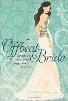
I wish I could say that the branding behind Offbeat Bride and the rest of the Offbeat Empire was heavily strategized, but the reality is this: the logos of the brand I’ve spent a decade promoting were barfed out by a random book designers working for Seal Press, the publisher of the Offbeat Bride book. The first edition of the book really was the worst in terms of logo. Remember when the website matched it? OMG so stank.

When the second edition of the book was being designed in 2009, Seal Press used an illustration that I’d licensed for use on the website, and then added a random scripty font that I’m assuming some underpaid book designer somewhere thought looked “wedding-y.” I have no idea. As author of the book, I had no control over it. I’ve been stuck with goddamn Aphrodite Pro for the seven years since.

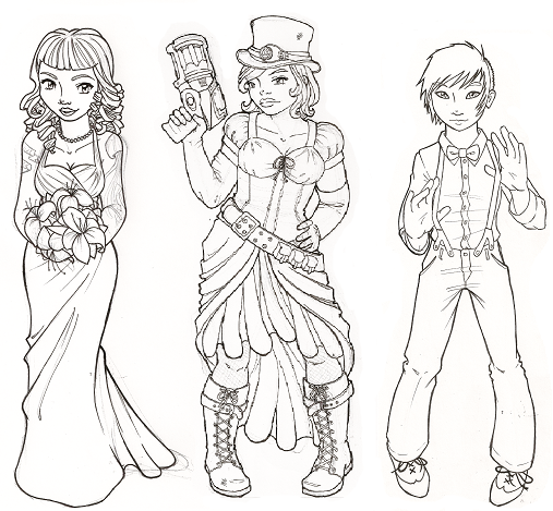
I had a perhaps-overly-loyal commitment to having the website match the book cover… but that changed in 2012 when, due to a miscommunication with the original illustrator, I had to hire a new illustrator to quickly (like, in a few week’s time) draw new bride characters to feature on the website. I kept Aphrodite Pro so at least the font would match… even if the illustrations were different.

Those characters have been around ever since. First Lite, Geeky, Dapper, then Betty and Fierce… they’ve been good to us these past few years, inspiring stickers, t-shirts, and even fan fic.
So why are we getting rid of them?
 First glimpse at the newest faces of Offbeat Bride
It's been four years since we last redesigned the header of Offbeat Bride, and while those three ladies (who I thought of as Lite, Gothy,... Read more
First, there’s the fact that time marches on, trends shift and evolve, and both the clothing styles and the illustration style were starting to feel a bit dated.
Then, there’s the reality that despite every illustration embodying at least five offbeat characteristics (gender, culture, style, ability, age, hair, ethnicity, body image, etc etc x 500), inevitably there were readers who were pissed that there wasn’t a character for them specifically. By the time we got around to Fierce, it was starting to feel like a thankless offbeat identity game of Whack-A-Mole. I don’t want to be doing focus groups and custom illustrations every year or two, and then dealing with backlash because, fucking hell, Ariel: where is the genderqueer Latina amputee with the kinky hair, diesel-punk prosthetic limb, non-high heels, and facial tattoo?!
I needed something we can settle in with.
As for the other site’s logos, Offbeat Home & Life was at least a bit more thoughtful — I licensed illustrations from an artist friend I’ve known since the ’90s — but Offbeat Empire’s logo was literally something my web developer scraped together as a joke in 2008. HA! Go, me.
Goals of the rebrand
Ok, so clearly the time for a rebrand is probably overdue! I worked with a designer in Western Australia named Sarah Enid from Less Than Three Studios. Here were the general concepts I gave her to play with:
- Branding should feel bold and relevant
- Keep our brand colors (charcoal with teal, pink, and green)
- Aim for iconography that can get us away from specific bridal trends/styles (like steampunk or goth) and toward more general brand values (inclusivity, tolerance, color, daring choices)
- Logo should be recognizable at MANY sizes, from favicons to Facebook avatars to big banners at the Lovesick Expos
- I’d love to have one logo concept that we can adapt for use across the sites
I even went so far as to ramble about our infamous “yay flag”:
We’ve used the “Yay flag” in various forms since 2009, and I like it because it’s celebratory, whimsical, non-normative (ie, not a ring, cake, etc — any wedding symbol you can think of, someone who reads our site isn’t doing at their wedding!), and not tied to people’s identities (don’t want to be too hetero-focused, or anything-else-focused!)…. a big part of our brand is the cheerleading and positivity, so the yay flag has been nice for that.
Sarah was like FUCK YEAH, YAY FLAG and we decided to run with it as our primary branding… the general idea being that the Offbeat Empire is about empowering you to let your freak flag fly. Whatever that means to you. Gender, culture, style, ability, age, hair, ethnicity, body image, etc etc x 500… we are here to support and cheerlead you in finding that flag, and waving it high.
A few bazillion back ‘n’ forth’s later, with a few sessions with my staff to get their opinions… here we are.

Now before you put on your Complainer Hat: no rebrand will ever make everyone happy — I totally get it! I totally respect it! I totally feel you, deeply and profoundly. But I’m stoked to move forward with imagery that’s bold and relevant, in our familiar brand colors, using a symbol that we’ve used across the Empire for many years.
We’ll be rolling the branding out slowly over the next few weeks on the websites, starting with Bride and then Home and Empire. But I couldn’t look at the old branding on Offbeat Bride’s Facebook page any more, so I got it up over there today.
Yeah, it’s sad to lose the characters, but we’ve actually been scaling them back across our assets for a couple years… so it’s not as hard as it could be. But for those of you who are mourning the passage of Lite, Geeky, Dapper, Betty, and Fierce? I’ve still got some sweet-ass bumper stickers left! Send me a SASE (pro-tip: a wedding invitation with an RSVP works super well!), and I’ll send a free bumper sticker, while supplies last:
Offbeat Empire LLC
1463 E Republican St #B20
Seattle WA 98112
https://www.instagram.com/p/BEovcLcq8AZ/?taken-by=offbeatbride


I love this! It is absolutely fresh, and it’s great design. Well done, as usual!
Looks amazing! I can see it being time to say goodbye to the characters. They rock but it’s time. 🙂 Yay for the freak (or whatever your thing is) flag flying! Yay indeed!
If you need me, I’ll be flying my normcore flag over here.
“….to big banners at the Lovesick Expos” Oh, this line kills me. KILLS ME. Sooo sad they’ve scaled that back. 🙁
I know! 🙁 We’ll be at the shows in Philly… but yeah.
I love the new round/square yay flag logo, looks great as a fb avatar! Go yay flag :)…but whats with the blurry header on facebook?
The larger logo will just have to grow on me, but thanks for once again sharing the behind the scenes news on what is an amazing business in so many ways
Clare, when I look at Facebook the header looks fine to me: http://awesomescreenshot.com/09a63i5vaa
What are you seeing?
LOVE IT!
As a graphic designer, I am all for this. All the this. And DEFINITELY THIS for adaptable logo across the brands!
Ya took the words right out of my mouth. Lol. It may be less “personal” than the characters, but that also makes it infinitely more versatile, and – like any good art – allows the viewer to interpret it however it best applies to them. And cute! And easily updatable when fashion/design values shift (those book covers are a perfect example of that 😉 )
Ug, those poor book covers… I mean, book designers have a thankless task, but OOF!
I love the new look! I have a blog myself and every few years I have to update the look of things – I totally understand the decision. I also love that the new branding really is inclusive to everyone!
So as a music geek, another unintended side benefit of the flag motif is, especially since it’s coming right out of the word “beat”, it looks a little like a color guard flag like in marching band, and perhaps emphasizes that actual “marching to the beat of your own drum” sort of idea. It’s really subtle and probably only something band geeks notice (although I was never in band), but I just thought that was kind of nifty. 🙂
Soooo… I loved it before I read the backdoor, and now am even just head over heels. Great new branding!! <3
I love the new logo! And I love that you tell us stuff like this. I find it so interesting. I’ll be sending you my request for the “vintage” sticker, though. I’ll miss those smiling offbeat faces. 🙂
Love the new look! And Yay to inclusivity and tolerance – something this site awesome has always practiced and promoted. Keep the awesome coming.
Getting my Geeky/Dapper slash published on OBE was one of my proudest moments. They will live on in my heart <3
And I *love* the new branding! Yay Flag ftw! If you need cheesy fanfic about font pairings, let me know 😉
Looks fantastic! 🙂
I don’t think there’s a “report bug” button right now, but on the Empire main page when I click on “Read More” it doesn’t do anything, I have to click on the actual title of the article to get to a real link.
ETA: Using Chrome on a PC running Windows 10.
We don’t have a report bug function, but you can always feel free to email me directly: https://offbeatempire.com/contact
I’ve reported this bug to Kellbot! Thanks for taking the time to report.